Page 59 - TLU magazine - The Way to The Top
P. 59
A GOOD EXAMPLE OF
TIMELESS DESIGN
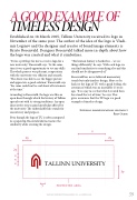
Established on 18 March 2005, Tallinn University received its logo in November of the same year. The author of the idea of the logo is Vladi- mir Loginov and the designer and creator of brand image elements is Kristo Rosenvald. Designer Rosenvald talked more in-depth about how the logo was created and what it symbolises.
“It was a privilege for me to create a logo for a new university,” Rosenvald says. “At the same time it was a good opportunity to test my skills. The whole process was pleasant, cooperation with the university was efficient and smooth. “The client was able to see the bigger picture and appreciate a good solution,” Rosenvald says “the same could not be said about all customers at the time.”
According to Rosenvald, the logo was like an open door through which the history of Tallinn spreads out with its strong traditions. An open door invites you to gain knowledge offered by the university. The unbreakable line stands for consistency and purpose.
Even though the logo of TU is often compared to a paperclip, Rosenvald did not notice the similarity while creating the design.
“The human fantasy is borderless – we see things differently,” he says. With each logo we can find similarities to something else and this should not be disapproved of.”
Rosenvald has never followed momentary trends but only timeless design. More so he looks at the logo of TU with a good feeling, the creation of which was an incredible 15 years ago. “It is a joy to see that what I created then has stood the test of time,” he says. This
gives assurance that the TU logo is a good example of timeless design.
Internal communications specialist Rein Olesk
TALLINN UNIVERSITY MAGAZINE / NO. 14 / SPRING 2020
59